swatch.png

Set-top Box experience


OSN had been running a premium broadcasting service with a “sub standard experience”. Off the back of the successes of WAVO and OSN PLAY we were challenged to use a similar methodology to design an entirely new android operating tier based Set-Top Box experience for TV

 
USB.png


Our goal for the project was to recapture the magic of TV. The original premise was simple: Allow users to know we have their interests at mind every time they pick up their remote. Our ambitions were to create a strong foundation that embraced a rapidly changing industry.

Our high level goals were to:

  1. Make it fast and easy to use.

  2. Create organic relationships with viewers.

  3. Create a platform that allows growth and deeper engagement.

MY ROLE
 

My role consisted of designing the overall experience as well along with motion design, which was achieved by working closely alongside the business.


Kickoff

knowing the landscape
 

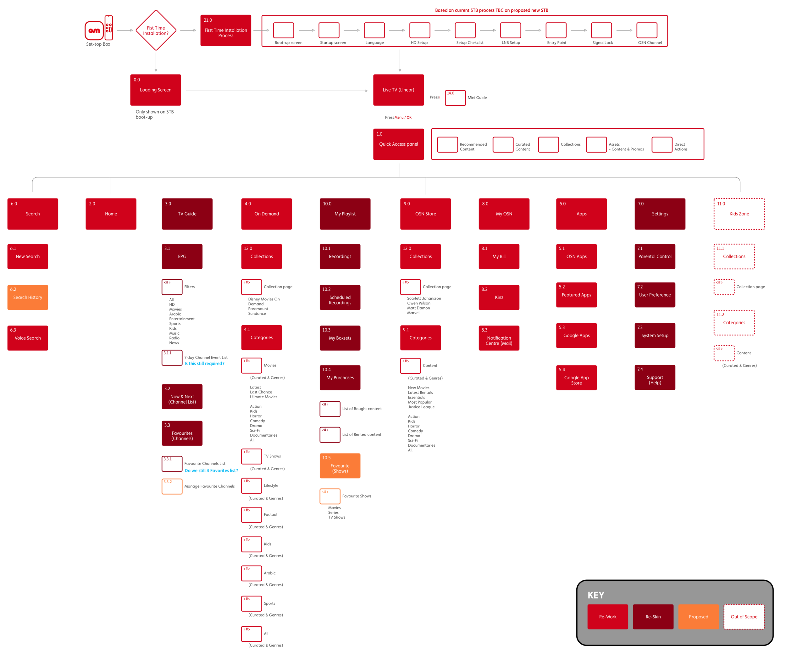
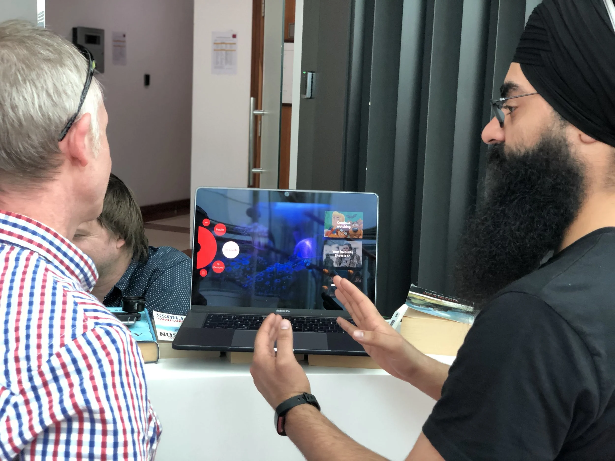
The Project started with a bang, in fact i was working on OSN PLAY alongside pre-discovery for set-top box.

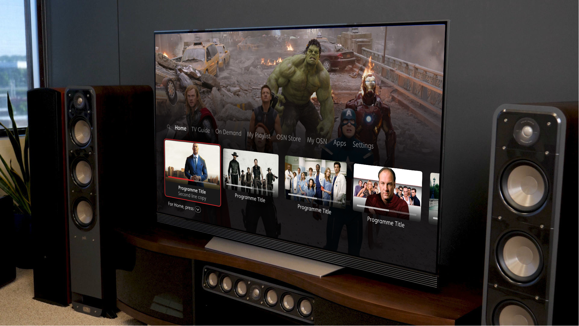
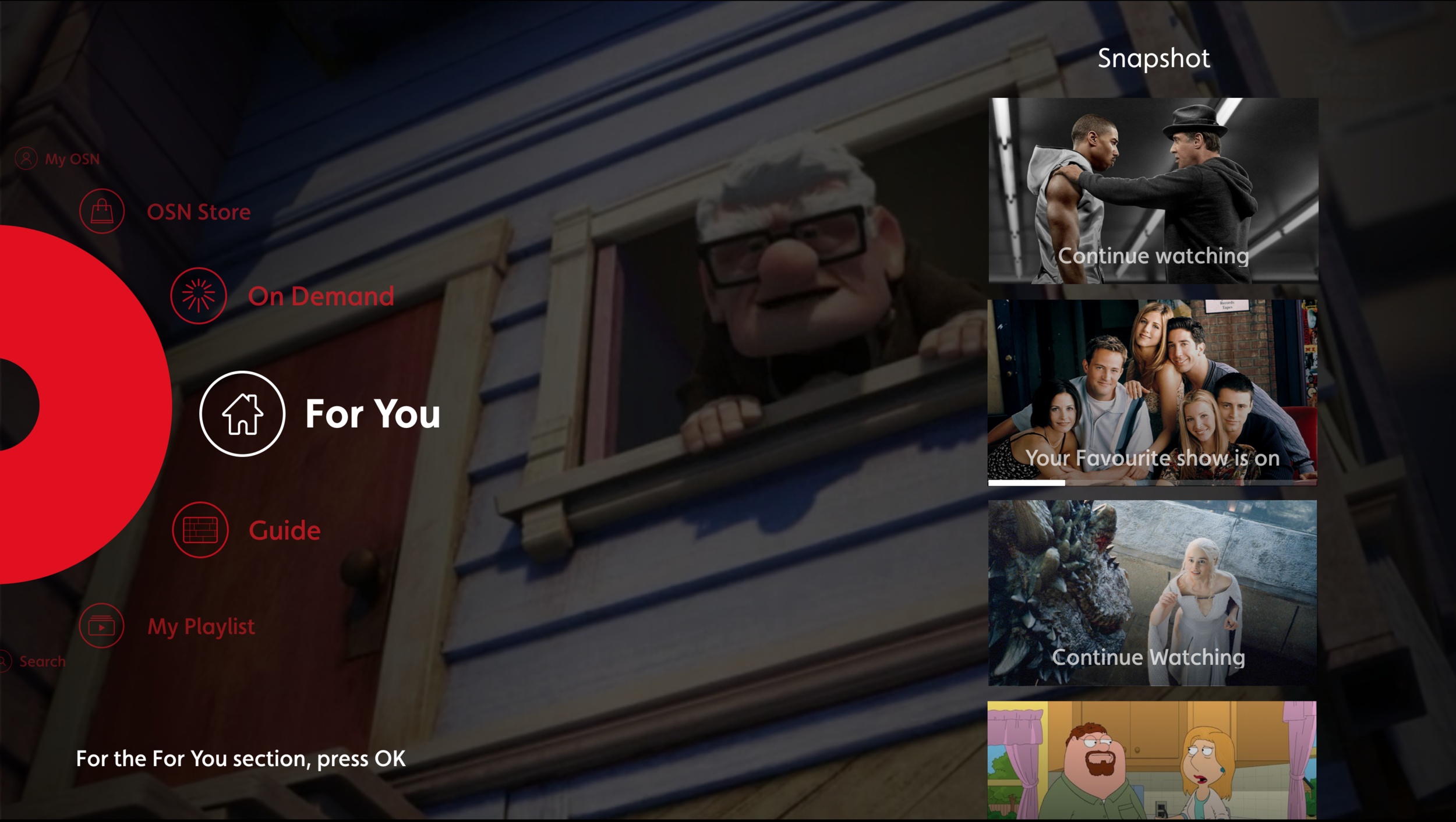
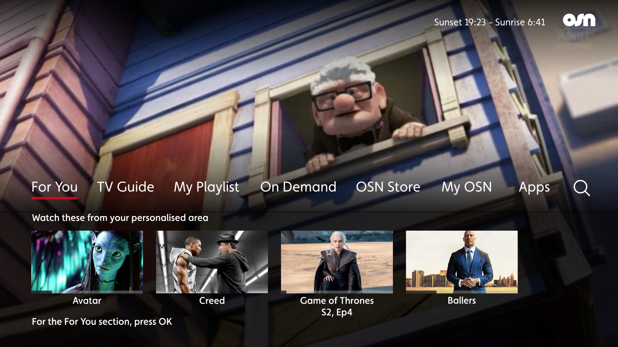
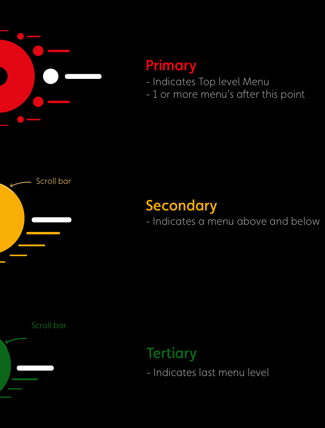
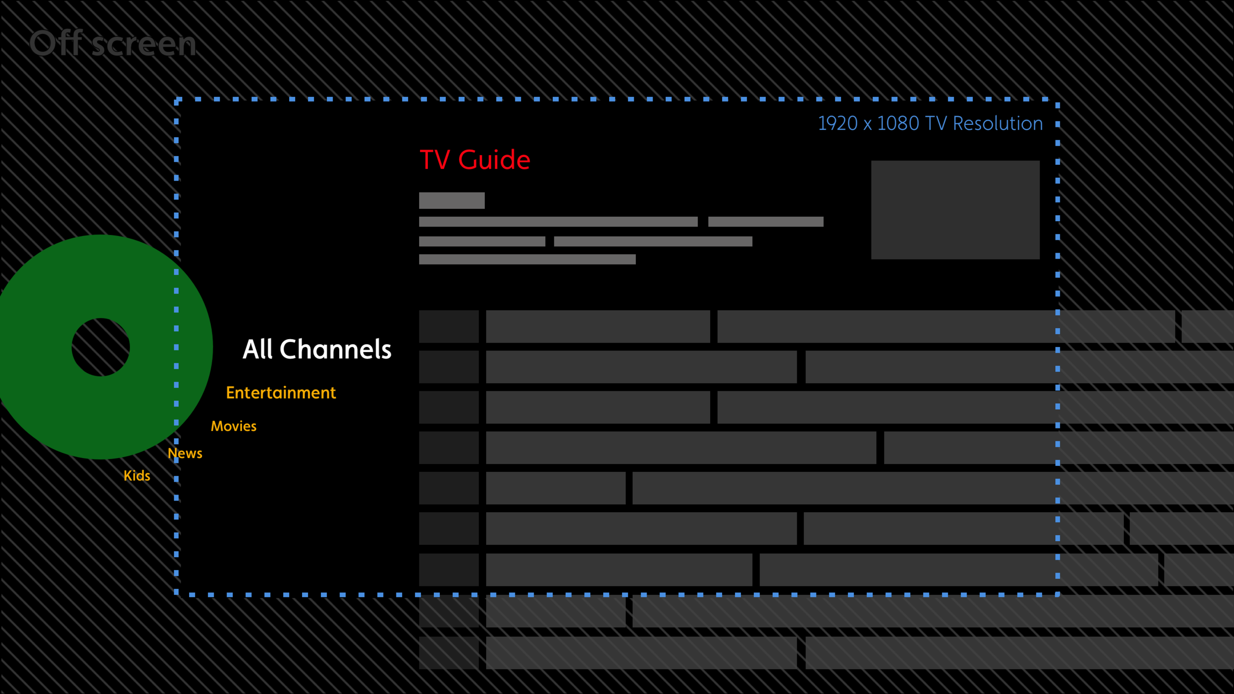
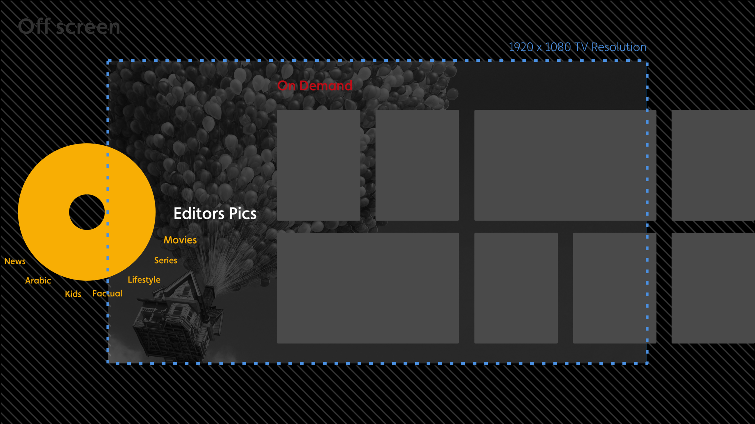
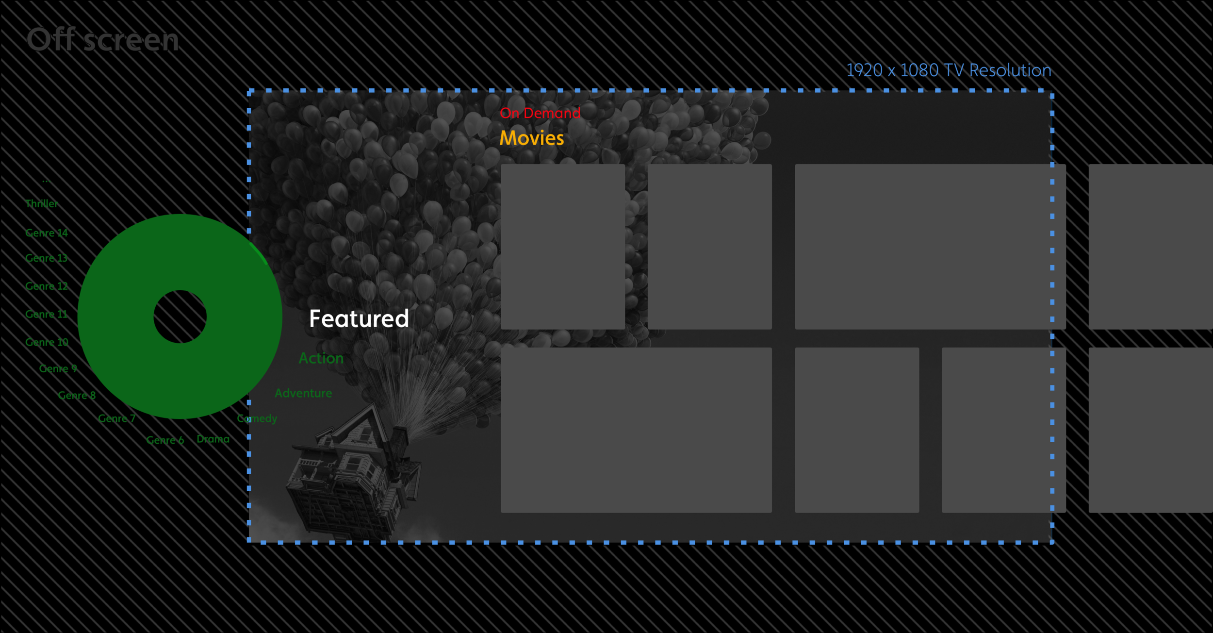
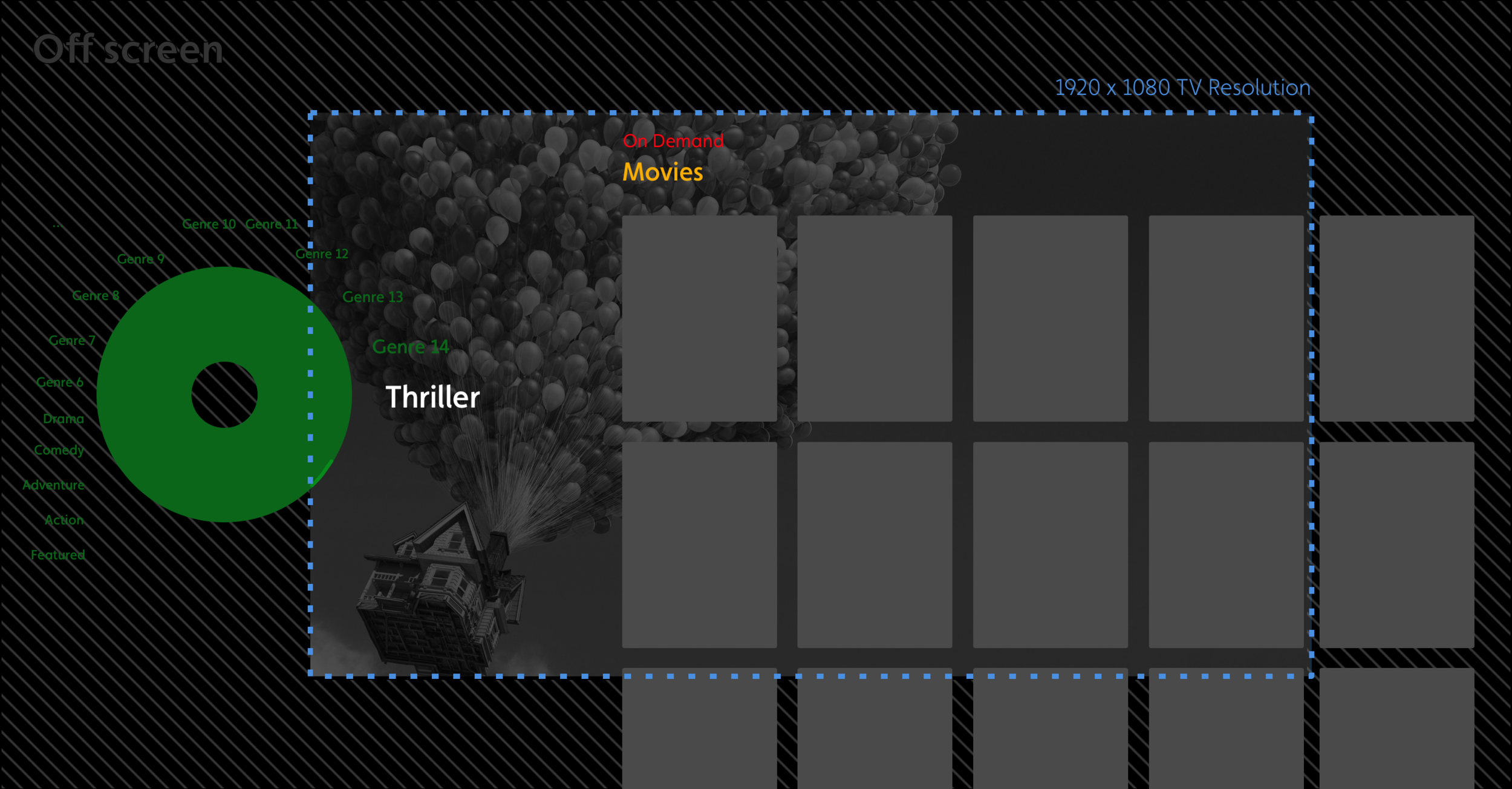
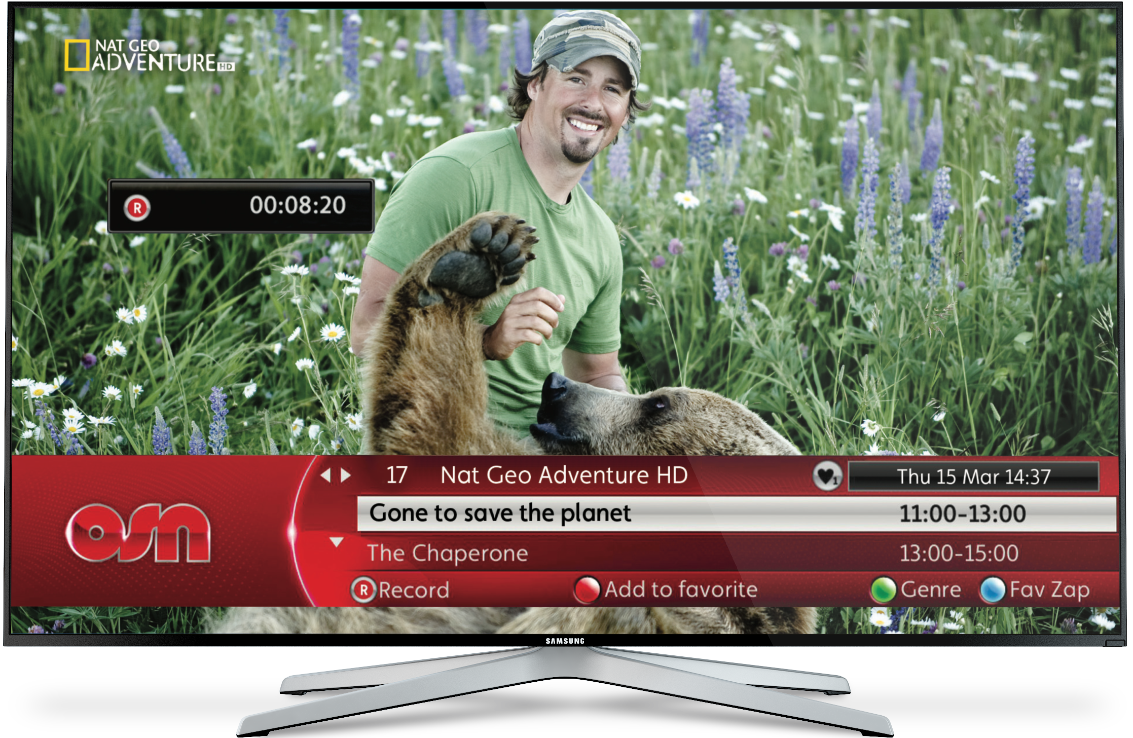
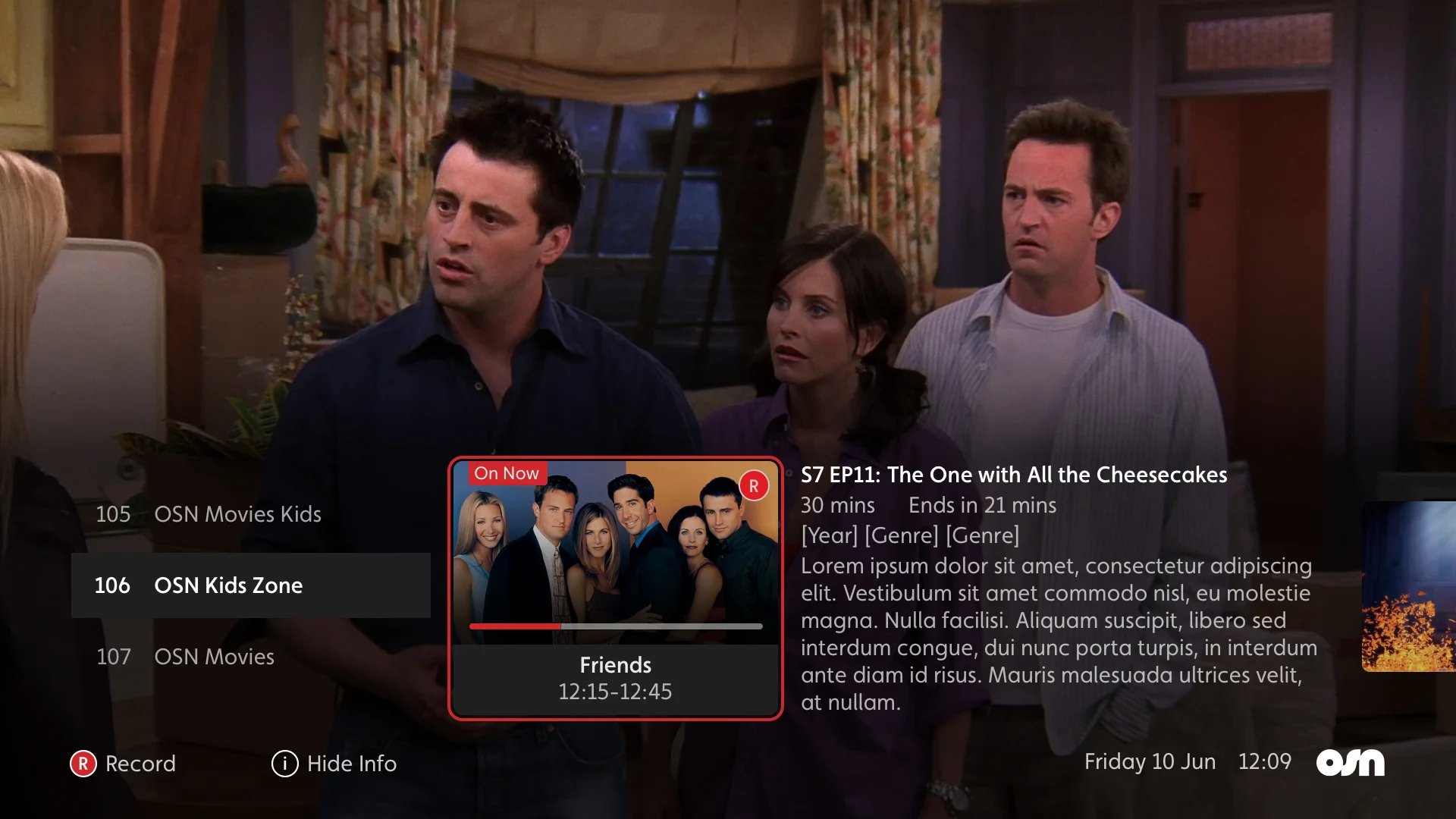
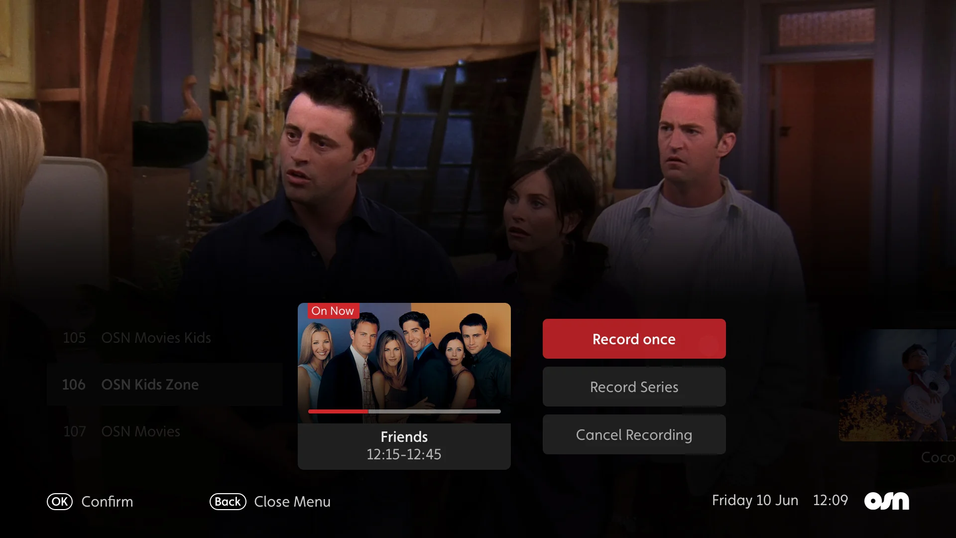
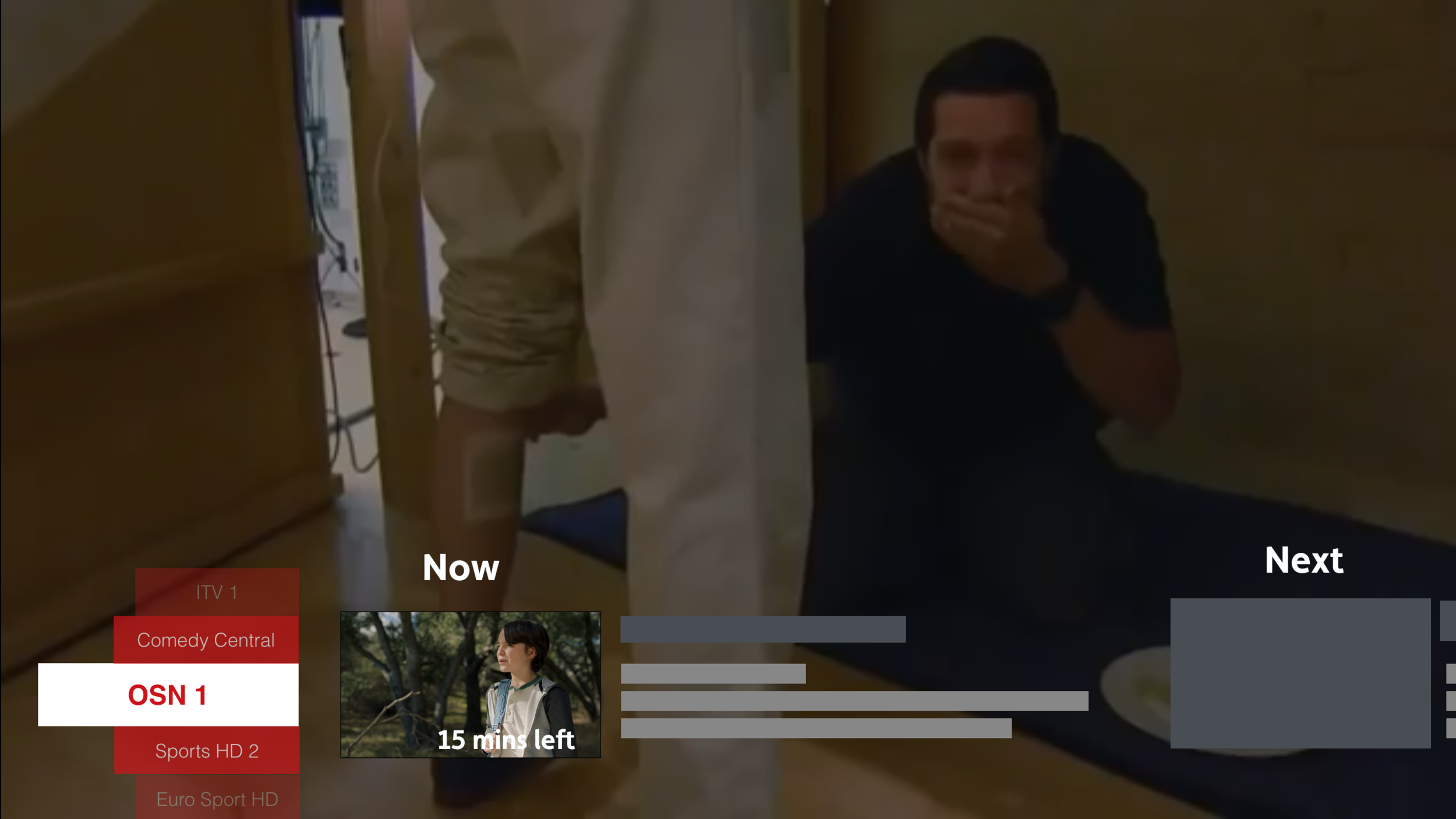
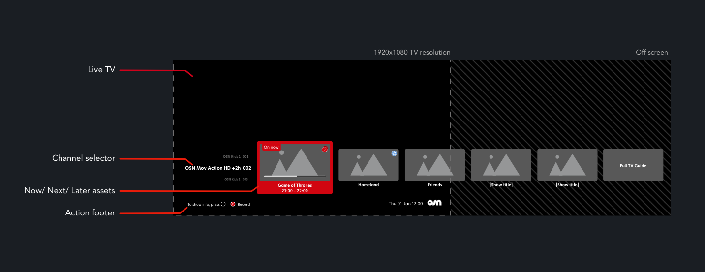
The Primary aim during kick off was to look at best in class experiences and viewer pain points to see where the gap in the market really was. This required key focus on on both breath and depth, understanding the key to the “10 foot TV experience

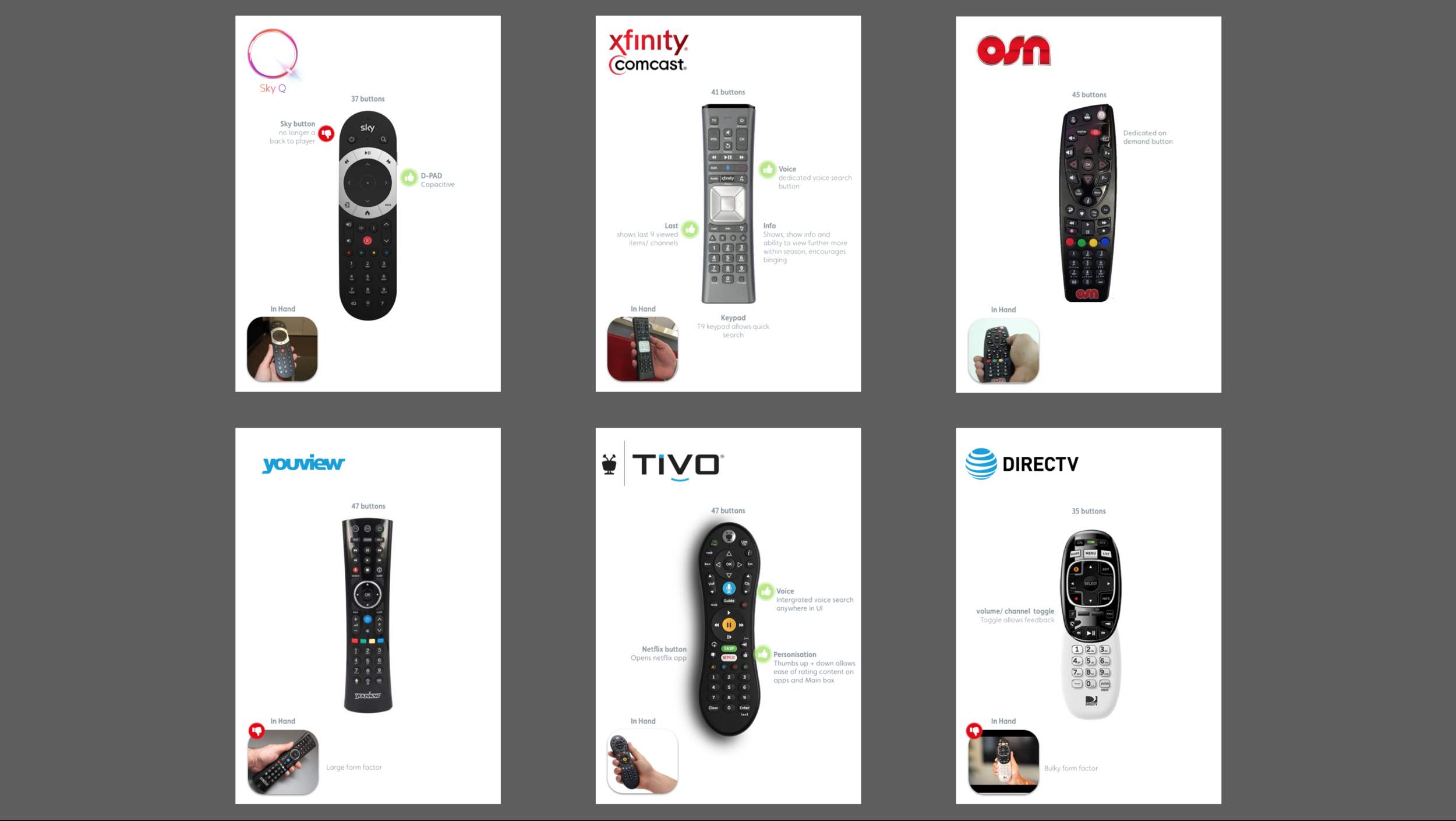
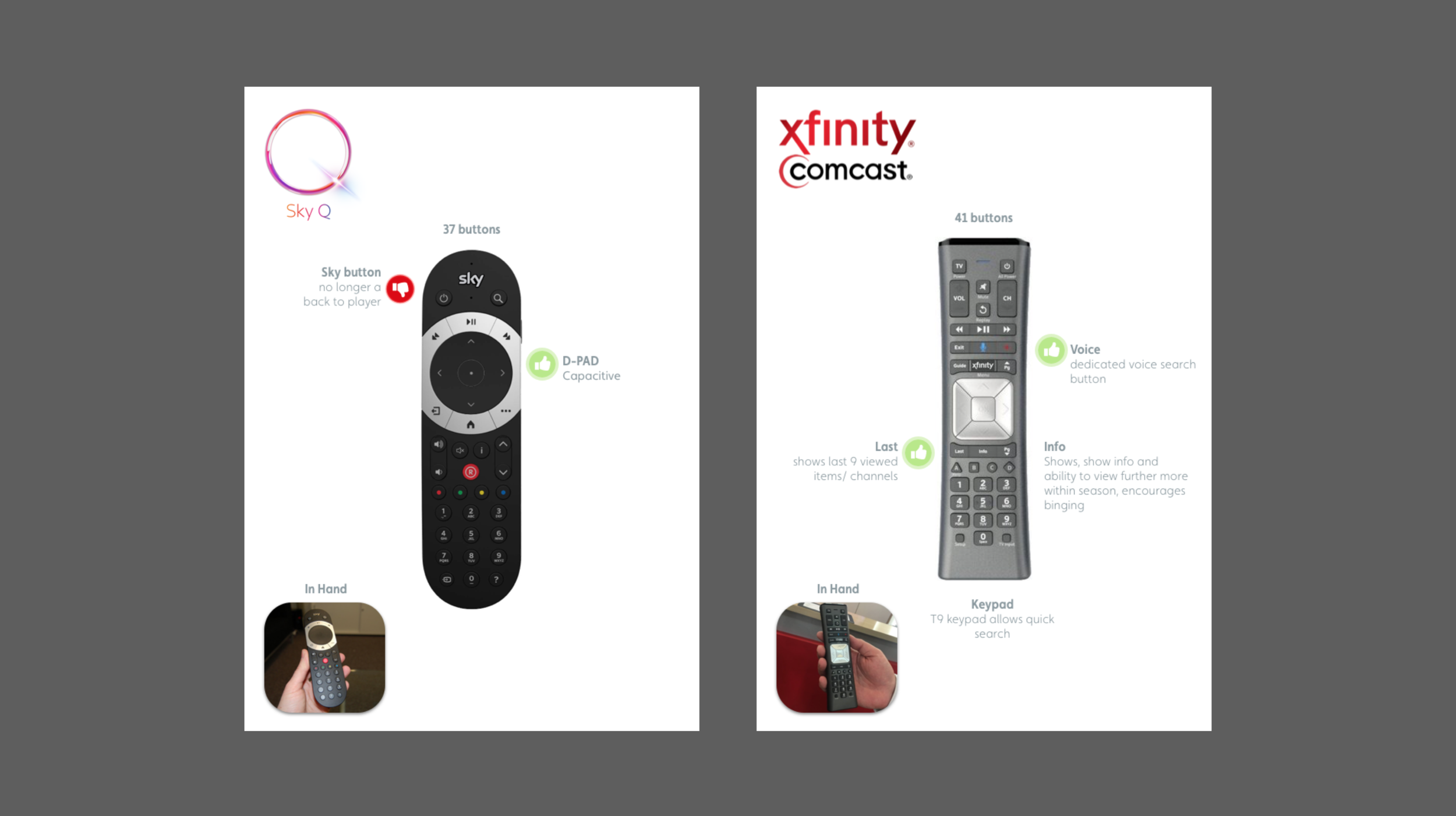
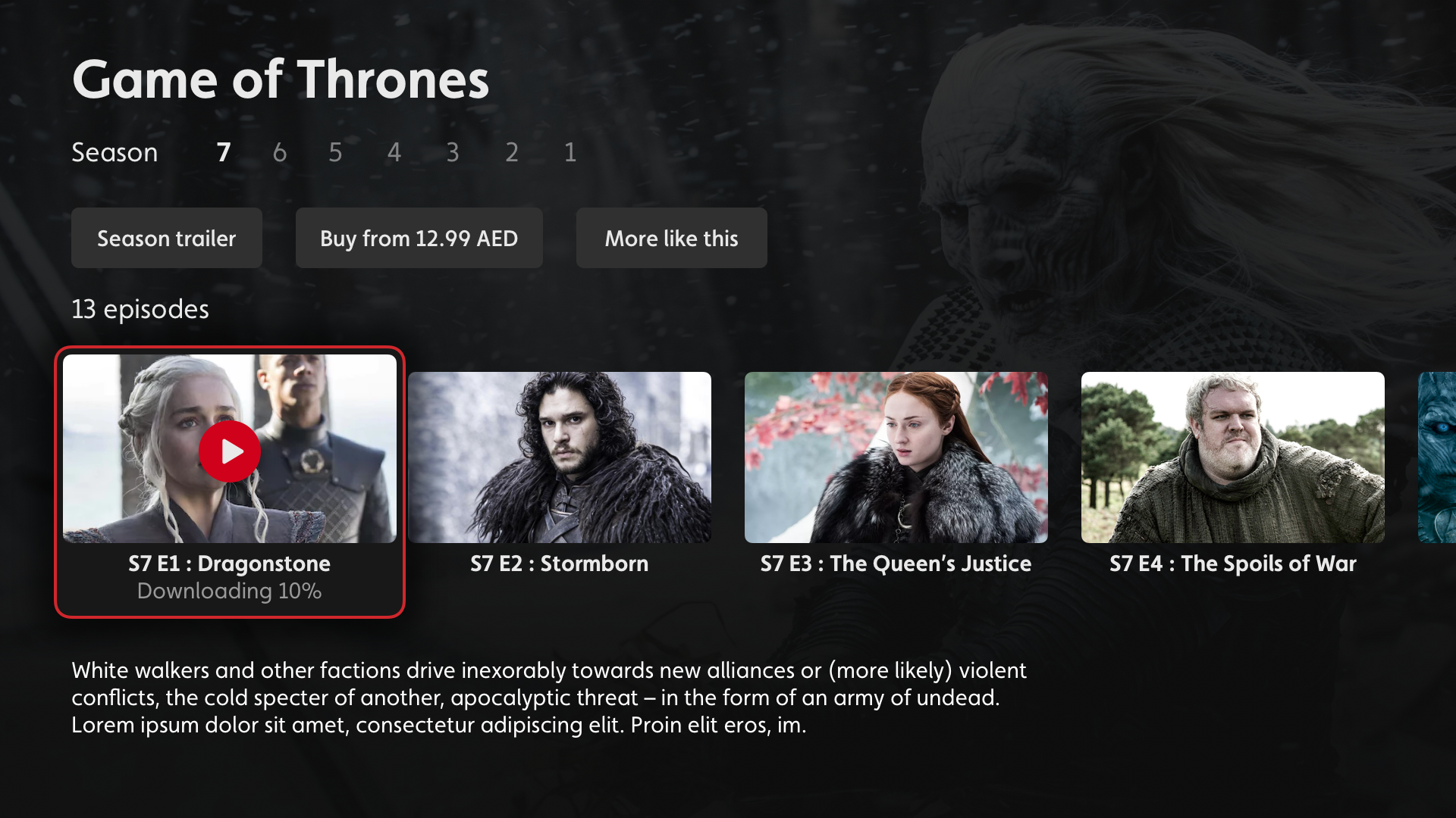
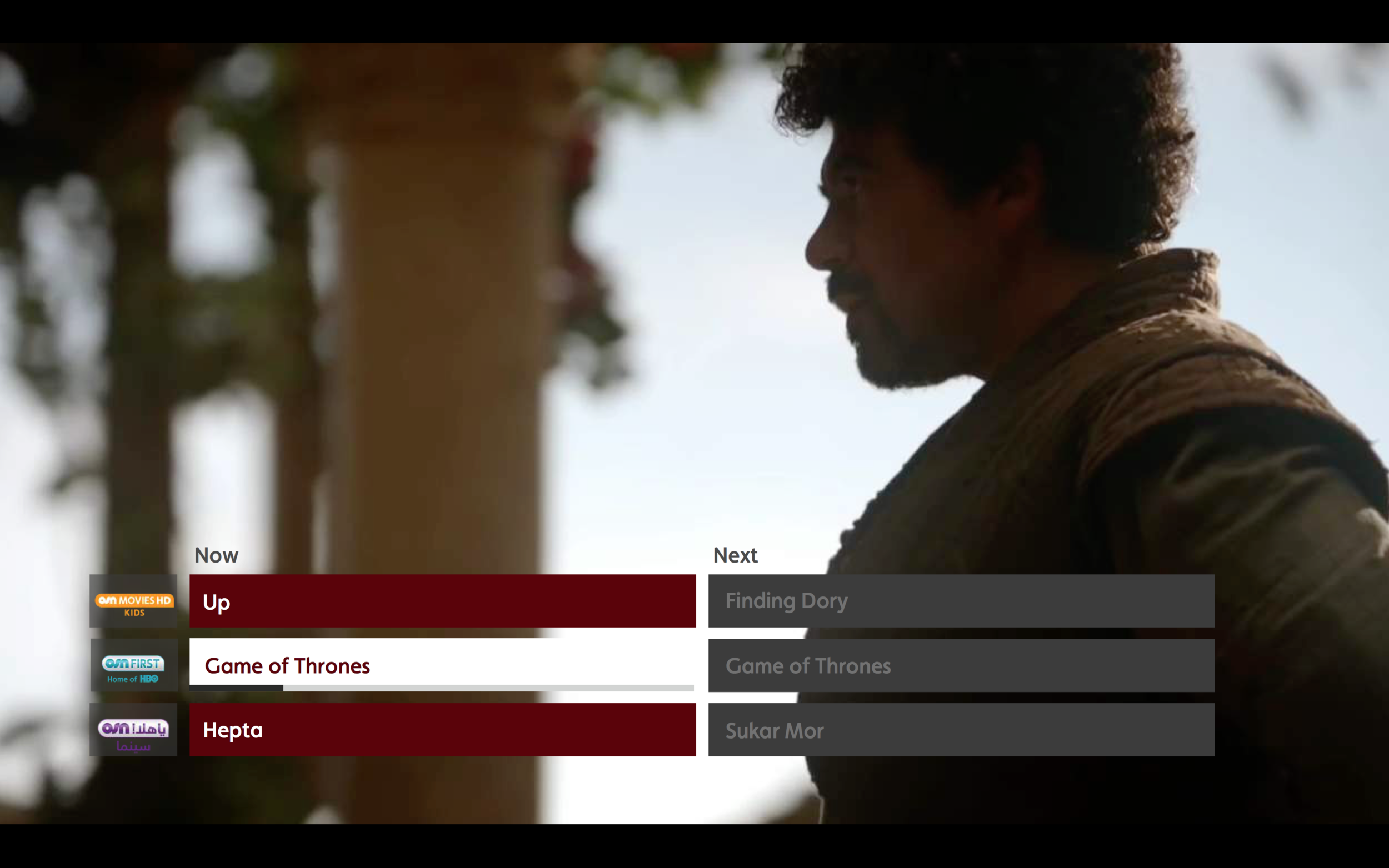
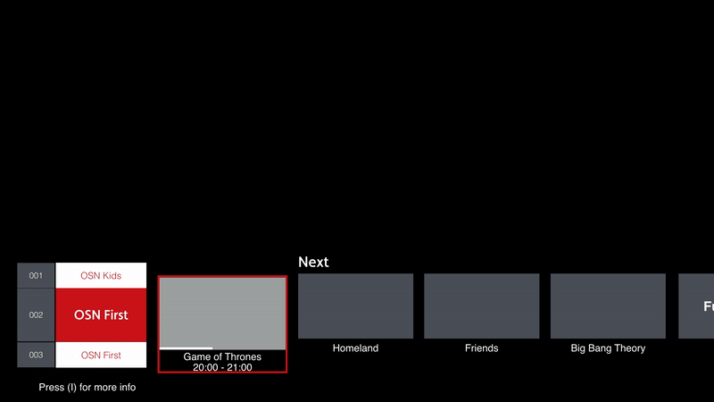
The uniqueness of TV is not only do you have a digital experience but users also have a tangible interaction with the brand through their remote control so it was a task in itself to look at the good, the bad and the ugly of the remote world.

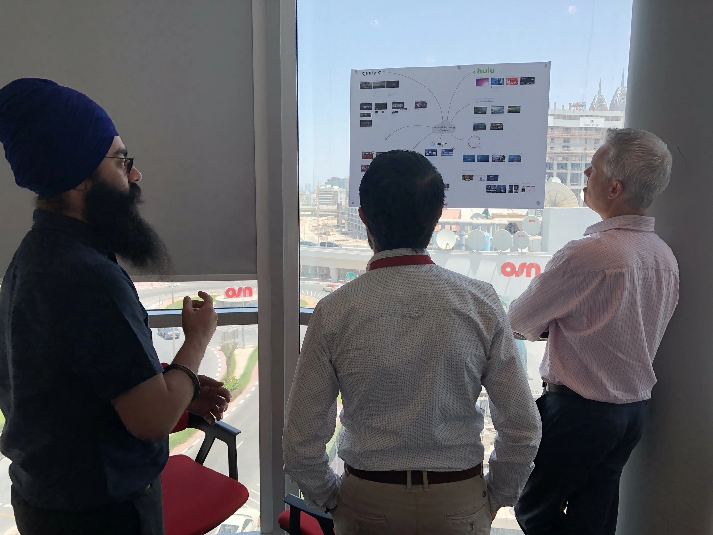
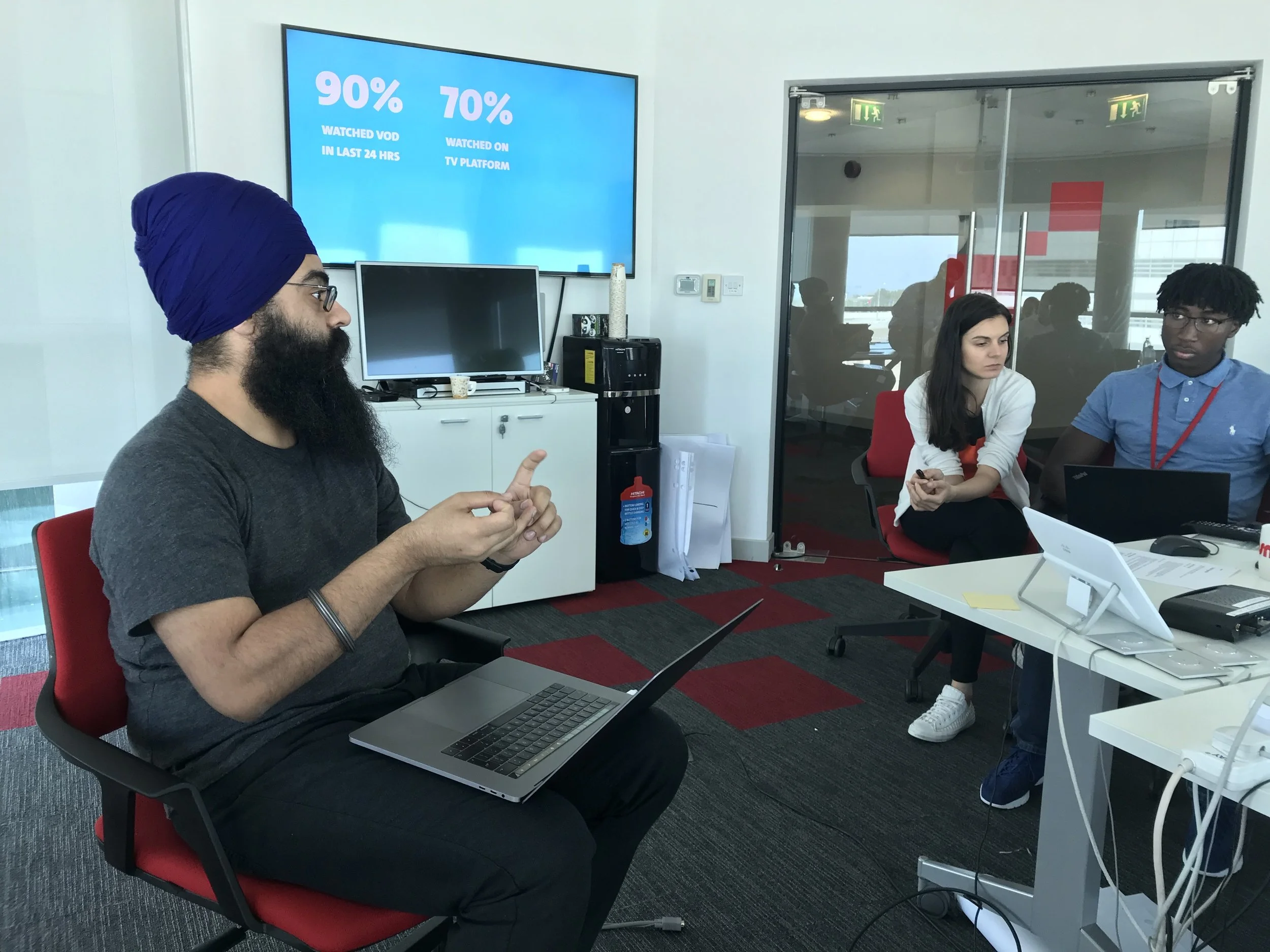
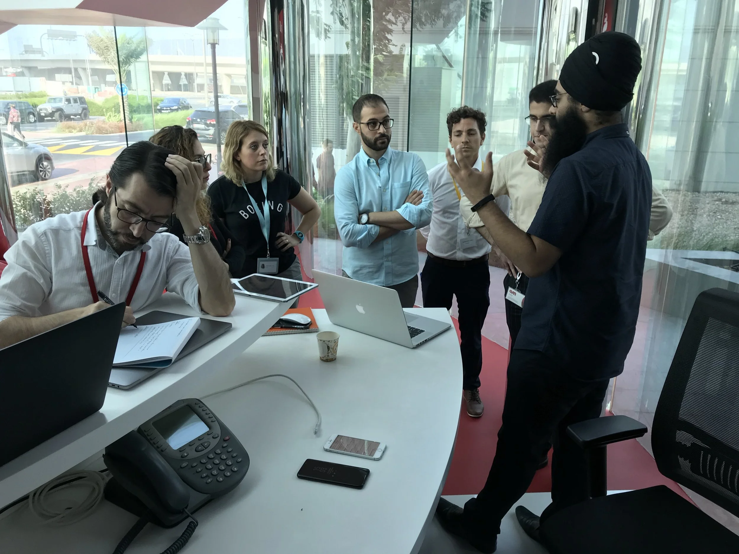
Our findings were validated as part of workshops with the business which also allowed us to build better understanding with real viewers insights.


Competitor reviews

Remote reviews


Insights

Viewers want a brand relationship 

Key attributes from the global market was that users wanted to feel as if the business was taking it's time to learn about their viewing needs and help cater towards their habits.

Users want content…now!

A pain point of the current UX was a very siloed approach, users really had to drill down into Menu’s, Folders. The key was offer content from the offset.


designing a conversatioin

a brand moment

Taking inspiration from viewer insights the team began brainstorming and prototyping while running workshops along with rapid guerilla testing in Dubai and back at our London base.

Two routes emerged


Circle

Circle.png

Designed around creating a branded experience

Quick Links

Designed with functionality in mind


Both routes consisted of the same functionalities, however went about achieving them in very different ways. The insights allowed us to draw on the premise of personalising from the offset with “Snapshots” of viewable content and easy access to the main menu.


Championing a route

The two routes went through prototyping and testing and as the circle was an idea I had championed I took ownership and led the design from the offset.

  • Information architecture

  • Building the navigational paradigm

  • Motion and Interaction


Sitemap


Spacial movement

A navigational paradigm


From the sitemap I understood there would be a maximum of 3 menu levels, the key was that a user would no longer need to select “back up” on the remote to access the next, or previous menus. All movement would be done with the directional keypad. I called it ‘spacial movement’

“The less of the ‘O’ you see the deeper you’re diving”


What Space meant*

tv_prez_01 copy 50.png

*Colours only for illustration purposes

How it moved

Movement GIF


creating clickable wireframes

Clickable wireframe


wireframing

On Screen & Off screen


Another challenge that came with the circle paradigm was allowing users to build an understanding of where items sat off screen. The key here was to always having peaking information, indicating to the user they can navigate to bring off screen information into view.

Below are a set of images showcasing how the design allowed the user to understand where information was and therefore how they would navigate to it. (select image to enlarge)


Testing

Testing the two approaches was fundamental for the design team to build a better understanding of middle-eastern cultural mindset as well as validating and building design confidence.


Those words

“…It’s a Business Decision”

Time and budget.png


As with most projects, businesses need to make crucial decisions, with the navigation it was the same for OSN. The dilemma here was the circle (spacial movement) paradigm would take longer to build and therefore cost more. It was parked for future development due to time and budget constraints.

Next step

Having worked alongside the team with continuous heathy debates on both paradigms I had built good knowledge of how Quicklinks worked and jumped onboard.


a world of variations

Product details

With Product detail pages being the singing and dancing area for many form of content, the thing that gets overlooked in design is the incredible amount of scenarios this one area must cater for.

OSN knew this was a challenge; there outgoing experience had a 4 different version of a product detail page for one asset.


Making it simple

It was key to work out the journeys to product detail pages which provide an understand of each touch point and therefore the scenarios that needed to be catered for.

 
STB_PDP_Journeys 2.png
 
swatch.png

The result


Multi Content

15.0_Product_Detail_10.png

Single content

15.1_Product_Detail_01.png
 

One page to rule them all

Catering for all needs


Now with consistency on product detail pages the catering for all scenarios would be done by variations of the call to actions.

Below is a schematic view taken from the specification document showcasing how I created a scalable product details pages and the variety of scenarios that were catered for.


Single content - rented from store

Rented - single.png

Multi content - download states

Multi content.png

Single content - On demand

On demand single.png


interrupting, while trying not to…

Mini guide Exprience

The goal was to create an elegant visual representation of information, with the ability to perform the same tasks as tv guide, with 70% less real estate.

Creating an uninterrupted experience that was consistent with the behaviours the user would already know.


Outgoing Mini Guide

 
Outgoing Mini guide.png
 
swatch.png

The Redesign


Show Details

1a - 2.jpg

options Menu

1a - 3b.jpg


How we got there

Early Testing

While testing navigation paradigms we run quantitative testing on variations of the mini guide to gain an understanding of what users preferred.


Traditional - time based

Route 1.png

Visual - Now/Next

Route 2.png

List - Now/Next

Route 1.png

“Minimised inturuption”

“Maximum number
to assets”

1 Click Access


Insights

  • Users wanted more context around understanding how much time of a show had passed or was remaining.

  • Users wanted a live preview of a channel before committing to tuning.

  • Users were less interested what time a show was on, it was more so about what was on.


Many iterations later…

Structure outline

Creating an uninterrupted experience which was consistent with the behaviours the user would already know. The structure followed the Main quick links panel.

 
Miniguide strucure.png


…Fixed or roaming focus?

synopsis Dilemma

Mini guide was the same paradigm as the primary navigation “Quick Links” which was roaming focus and therefore the synopsis was hidden from view,

The aim now was to find a more elegant way to showcase the 270 characters, the dilemma was that in-order to create a more seamless, non-disruptive interaction, the mini guide navigation would need to be fixed focus.

Whats wrong with that? - short answer. Nothing. It wasn’t something that had been used throughout the experience, but it needed buy-in from the rest of the team along with the client.


Fixed focus

ezgif.com-video-to-gif (2).gif

Roaming focus

ezgif.com-video-to-gif (3).gif